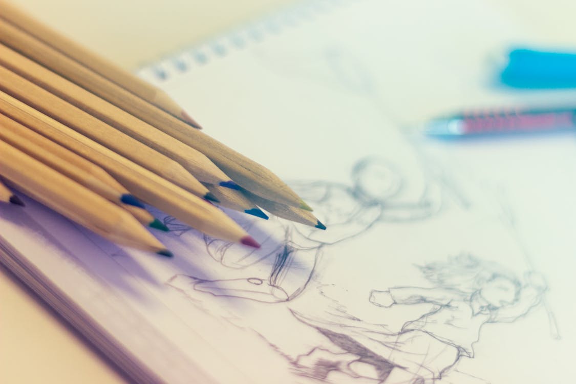
How to Add Tone and Screentone to Manga Pages
March 15, 2026 · 9 min read · By Mangaka.online Editorial
Understanding Screentone: The Essential Manga Technique
Screentone is perhaps the most visually distinctive technique in manga. The characteristic halftone dot patterns that create shading and texture in black-and-white manga are instantly recognizable and impossible to achieve convincingly with pencil shading alone.
But screentone isn’t merely decorative—it’s a communication tool. The density and pattern of screentone instantly convey:
- Spatial relationships: Darker tones in the foreground, lighter tones in the background
- Material properties: Metal reflects differently than fabric; skin is smoother than rough surfaces
- Emotional atmosphere: Dense tones create tension and heaviness; light tones feel peaceful
- Time of day: Shadows suggest specific times and lighting conditions
- Character importance: Primary characters often receive more refined tone work than secondary characters
Mastering screentone separates amateur manga from professional work. Mediocre inking can be salvaged by superior tone work; conversely, pristine inking undermined by careless toning reads as incomplete.
This guide covers both traditional screentone (which remains relevant for understanding the technique and for specific artistic effects) and modern digital toning (which has become the standard for contemporary manga creation).
What Is Screentone and Why It Matters
Traditional screentone consists of sheets of adhesive-backed paper with pre-printed halftone dot patterns. The dots are so small and regular that when viewed at normal reading distance, they blend into perceived greys and blacks. Different densities (measured as percentages from 10% to 90%) create tonal ranges from nearly white to nearly black.
Why Manga Uses Screentone Instead of Paint
Manga uses screentone specifically because of how ink and printing technology work:
Printing limitations: Traditional printing can only reproduce pure black ink or white paper—no true greys. Screentone dots are pure black, but their spacing creates the optical illusion of grey. This is called a “halftone” screen.
Scanning clarity: When a finished inked manga page is scanned, screentone dots reproduce cleanly. Grey paint, by contrast, scans muddy and often reproduces with inconsistent tones.
Reproducibility: Screentone patterns are standardized, ensuring consistency across pages and chapters. Custom grey shading has no such guarantee.
Speed: Professional mangakas working on tight serialization schedules cannot afford to spend hours carefully shading with pencils. Screentone application is significantly faster.
Control: Screentone patterns are uniform and predictable. You know exactly how a specific screentone percentage will read, making production timelines reliable.
Traditional Screentone Application: The Physical Process
Understanding traditional screentone techniques provides foundation knowledge and is still relevant for specific effects and artistic styles.
Selecting the Right Screentone
Screentone comes in numerous densities and patterns:
Dot patterns (halftone dots): The most common type. Available from 5% to 90% density.
Line patterns: Straight lines, cross-hatching patterns, or custom designs. Used for textures and stylistic effects.
Gradient tones: Pre-made gradients that transition from light to dark. Extremely useful for smooth shading.
Texture patterns: Clouds, sand, fabric textures. Add visual variety and specific material properties.
Professional screentone brands include Deleter, Daytonainc (Dayton), and Sun-Star. These Japanese brands are the industry standard because they’re designed specifically for manga with Japanese printing processes. Western alternatives exist but often feel slightly different in print.
The Traditional Application Process
Prepare your artwork: Your inked page is ready, with no pencil marks remaining. The page is dry and clean.
Select appropriate screentone: For the specific area, choose a screentone density that matches your vision. Light skin tones typically use 10-30% tones. Mid-shadows use 40-60%. Deep shadows use 70-90%.
Cut the screentone: Using a sharp craft knife or screentone cutter, carefully cut the screentone sheet to roughly cover the area you’re toning. Cut slightly larger than needed—you’ll trim to exact size.
Apply the screentone: Peel back a corner of the screentone backing and position it over the area. Once positioned correctly, press down firmly and smoothly, working from one side to the other to avoid air bubbles.
Trim excess: Using a sharp craft knife, carefully trim the screentone edges to match the artwork’s lines. This requires a steady hand and multiple shallow cuts rather than trying to cut through with one pass.
Burnish the edge: Use a burnishing tool to seal the screentone edge, preventing it from peeling during handling or printing.
Combining Multiple Screentones
The most sophisticated traditional toning uses multiple layers of screentone to create complex shading:
A character’s face might have a light 20% screentone on one side and a medium 50% tone on the shadowed side. Where both tones overlap, they create an even darker tone. This layering is how professional mangakas achieve smooth, believable shading.
When layering, pay attention to dot angle. Different screentone sheets have different dot angles (0°, 45°, etc.). Overlaying screentones at different angles creates moiré patterns—visual interference that’s usually undesirable. Professional screentone selection carefully considers angles to avoid moiré.
Traditional Application Challenges
Air bubbles: Improper application creates air pockets that look like gaps in coverage.
Uneven pressure: Inconsistent pressing creates faded areas or regions where screentone adhesion is weak.
Damaged edges: Sharp tools slip or create frayed edges requiring correction.
Time-consuming: Applying screentone to a full page traditionally takes 2-4 hours depending on complexity.
Permanent: Mistakes in screentone application are difficult to correct. Removal typically damages the paper underneath.
Digital Screentone in Clip Studio Paint: Modern Standard
Modern manga creators almost universally use digital screentone through Clip Studio Paint or similar software. Digital toning offers unmatched speed, flexibility, and non-destructive editing.
Setting Up Clip Studio Paint for Toning
Clip Studio Paint includes a comprehensive tone library and screentone tools specifically designed for manga.
Access the Material Library: Clip Studio Paint’s built-in tone materials include thousands of screentone patterns and densities, organized by type (dots, lines, gradients, textures).
Create a tone layer: On a new layer above your inked artwork, you’ll apply tones. This layer-based approach allows adjustment, deletion, or modification of tone without affecting the ink layer.
Select appropriate materials: For character work, tone materials 20-70 are common. The material palette allows previewing tones at actual size before application.
Applying Digital Screentone
Select a tone material: Browse the tone library and select a specific screentone pattern and density.
Define the area: Use selection tools (lasso, magic wand, or pen) to select the area you want to tone.
Fill with tone: Click to apply the screentone to the selected area. The tone fills the selection with perfect, consistent application.
Feather edges (optional): Tone edges can be hard and defined or feathered for gradual transition. Feathering softens the tone boundary.
Layer multiple tones: Overlay different tone densities to create complex shading. Because layers are non-destructive, experimenting is consequence-free.
Advantages of Digital Toning
Speed: Applying screentone to a complex full page takes 30-60 minutes digitally, compared to 2-4 hours traditionally.
Non-destructive: Dislike a tone application? Delete it and try again instantly. No damage to artwork.
Infinite revisions: Change tone densities, patterns, or coverage after application without reworking.
Precise control: Select and tone specific areas with pixel-perfect accuracy.
Material preview: See exactly how a tone will look before committing.
Unlimited materials: No need to purchase physical screentone sheets. All materials are included in the software.
Screentone Density and Strategic Application
Understanding screentone percentages and how to use them strategically is crucial for professional-quality results.
Common Tone Densities and Their Uses
5-15% (very light): Barely perceptible to the human eye. Used for subtle highlighting or extreme light values. Often skipped entirely.
20-30% (light): Ideal for skin tones in light, and very light shadows. Common for character faces and prominent areas.
40-50% (medium): Mid-tone for shadows and secondary forms. Bridges light and dark.
60-70% (dark): Deep shadows and strong contrast areas. Creates visual punch.
80-90% (very dark): Reserved for the darkest shadows, deepest backgrounds, or extreme contrast. Use sparingly.
Strategic Tone Placement
Separate foreground from background: Foreground elements receive stronger, more refined toning. Background elements use lighter, simpler tones. This naturally pushes backgrounds visually backward.
Emphasize focal points: The most important elements of a panel (character faces, key action) receive the most sophisticated and varied toning. Secondary elements receive simpler treatment.
Create mood through tone: Dense tone coverage creates tension, heaviness, and seriousness. Light tone coverage creates openness, airiness, and lightness. The overall tone density of a page communicates emotional atmosphere.
Minimize for clarity: White space is powerful in manga. The most readable, dynamic panels often use toning sparingly. Overuse of tone creates visual noise and eye fatigue.
The Principle of Negative Space
The single most important principle of professional toning is understanding negative space. The white areas of your page—completely un-inked, un-toned areas—are as important as the black and grey.
Beginners often tone excessively, covering most of the page with tone patterns. This creates a cluttered, muddy appearance. Professional mangakas use tone strategically, leaving significant white space that creates contrast, clarity, and visual breathing room.
The ratio often used is approximately 30-40% tone, 60-70% white space for balanced, readable pages. Adjust this ratio based on mood and pacing—action scenes might use more tone for intensity; quiet moments might use minimal tone for clarity.
Texture Patterns and Specialized Effects
Beyond standard screentone dots, specialized patterns create specific visual effects.
Gradient Tones
Gradient screentones transition smoothly from light to dark. These are essential for:
- Shading curved surfaces like faces or rounded objects
- Creating smooth transitions without visible tone boundaries
- Suggesting soft lighting or atmospheric effects
Gradient tones are pre-made in Clip Studio Paint, eliminating the need to manually blend multiple tones.
Texture Patterns
Specialized texture patterns suggest material properties:
- Cloud patterns: Water, smoke, atmospheric effects
- Fabric patterns: Clothing texture
- Metallic patterns: Reflection and shine
- Stone/concrete patterns: Rough surfaces
- Wood grain: Natural materials
Strategic use of texture patterns adds visual richness and specificity without requiring detailed illustration.
Speed Line and Effect Integration
Screentone can be applied over speed lines and effects to enhance them. This integration creates seamless, professional-looking effects panels and action sequences.
Complete Toning Workflow: From Inks to Final Page
Understanding the complete workflow helps you tone efficiently and professionally.
Review the inked page: Examine the linework and identify areas that need toning to create form, contrast, and visual hierarchy.
Plan your tones: Rather than applying tone randomly, plan which areas need which tones. Light areas get light tone, mid-tones get medium tone, shadows get dark tone.
Apply base tones: Start with primary toning areas—character faces, important objects, key shadows. Use medium-density tones.
Layer and refine: Add darker tones to shadow areas, lighter tones to subtle highlights. Build complexity through layering.
Background toning: Apply tone to backgrounds after character toning. Background tones should be generally lighter and less detailed than character tones.
Final check: Step back and evaluate the overall page. Is tone distribution balanced? Is white space adequate? Do focal points have appropriate emphasis?
Scan and adjust: Once toning is complete (digital or traditional), scan the page at high resolution (600 DPI minimum). Use Photoshop to adjust levels, contrast, and ensure clean black and white with good grey tones.
Common Toning Mistakes to Avoid
Excessive tone coverage: Every shadow gets heavy tone, every edge gets definition. Result: muddy, cluttered pages.
Inconsistent tone densities: Tone percentages vary randomly rather than logically following light direction and form.
Tone applied without planning: Random toning decisions create pages that feel scattered and unclear.
Poor contrast between tones: Using similar densities side-by-side creates insufficient visual contrast.
Ignoring white space: Dense toning throughout the page exhausts the reader’s eye.
Tone patterns at wrong angles: Tones applied without considering dot angles create moiré patterns (in traditional work).
Developing Your Toning Style
While screentone principles are universal, professional mangakas develop personal toning styles. Some prefer minimal toning (almost purely black and white). Others use dense tone coverage for dramatic effect. Some prefer realistic halftone patterns; others use stylized texture patterns.
Develop your personal style by:
- Studying work you admire: How do your favorite mangakas approach toning?
- Experimenting extensively: Try different tone densities, patterns, and placements
- Making deliberate choices: Each toning decision should serve your visual goals
- Building consistency: Over time, your personal approach becomes recognizable
Advancing Your Manga Craft
Now that you understand toning, you have all the major technical skills for creating professional manga:
- Manga Drawing Fundamentals: Ensure your anatomy and perspective support your toning
- Manga Inking Techniques: Create clean linework that shows toning to its best advantage
- Tools for Aspiring Mangakas: Detailed guide to screentone supplies and digital tools
Remember that toning mastery comes through thousands of pages of practice. Your early toning work will likely feel tentative. This is normal—learning to use tone confidently requires experiencing both subtle and dramatic toning approaches. Keep working, keep experimenting, and your toning will gradually reach professional quality.
Return to Become a Mangaka Hub to explore all resources for aspiring manga creators, or continue developing your technical skills with other manga creation guides.
Frequently Asked Questions
What is screentone in manga?
Screentone is a patterned adhesive sheet (or digital equivalent) placed over inked manga art to create shading, textures and grey tones without painting.
Do I need screentone or can I just use grey paint?
For print manga, screentone is essential since grey paint can create muddy scans. Digital screentone in Clip Studio Paint replicates traditional halftone patterns perfectly.
What screentone percentage is most commonly used in manga?
30–40% dot patterns are most common for skin/light shadows. 60–70% for mid-tones and darker areas. Use sparingly — white space is powerful in manga.
Recommended Tools
All tools →Copic Multiliner SP Set
The refillable professional-grade fineliners used by studio manga artists. Ultra-consistent line width, archival ink.
Refillable · Professional grade
Sakura Pigma Micron 6-Pack
The go-to set for manga inking. Pigment-based ink that doesn't bleed, won't fade, and ranges from ultra-fine to bold.
0.2mm–0.8mm variety pack

Manga in Theory and Practice
The JoJo creator reveals his creative process — how to build tension, construct iconic characters, and master the flow of panels.
By Hirohiko Araki · JoJo creator
Amazon affiliate links — we may earn a small commission at no extra cost to you.