How to Add Tone and Screentone to Manga Pages: Complete Guide
Master the art of manga toning with traditional screentone sheets and digital techniques. Learn shading, texture, and atmosphere creation.
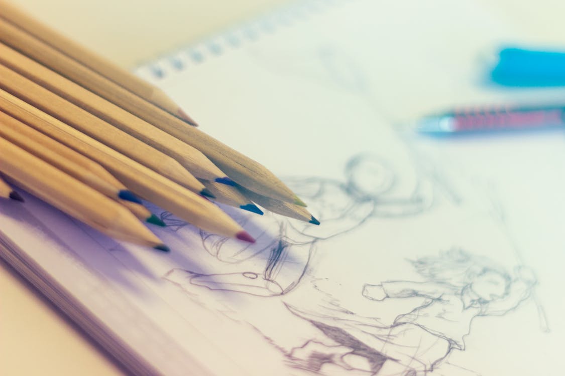
Screentone is the lifeblood of manga art. While manga is fundamentally a black-and-white medium, screentone—the application of patterned or solid gray tones—transforms flat ink work into dimensional, atmospheric artwork. Mastering toning separates amateur manga from professional publication-ready work. This comprehensive guide covers everything you need to know about adding tone and screentone to your manga pages.
Understanding Screentone: History and Purpose
Screentone emerged in manga as a practical solution to the challenge of creating shading and texture in black-and-white reproduction. While other illustrations use continuous-tone shading achieved through careful pencil work, manga artists needed a system that would reproduce cleanly through the printing process and work within tight deadlines.
Japanese manga artists developed and perfected screentone application as an art form unto itself. By the 1970s and 1980s, screentone became essential to manga’s visual language, with experienced artists using tone not just for shading but for mood, atmosphere, and stylistic expression.
Screentone serves multiple functions in professional manga:
Creating dimension and form: Tone indicates light sources, creates shadows, and shows three-dimensional form on otherwise flat surfaces.
Establishing mood and atmosphere: Heavily toned pages feel dark and serious; lightly toned pages feel bright and optimistic. Consistent toning establishes visual tone consistent with narrative tone.
Guiding reader attention: Applying tone to important elements draws reader focus while leaving background elements untoned simplifies the visual field.
Adding texture and detail: Pattern tones create texture suggesting fabric, skin, metal, or other materials without requiring line work.
Achieving professional publication standards: Publications expect consistent, professional-quality toning that demonstrates technical skill and compositional understanding.
Types of Screentone: Understanding Your Options
Screentone comes in various types, each with distinct visual qualities and appropriate applications.
Dot Tones
Dot tones are the most common screentone type, consisting of dots arranged in regular patterns at varying densities. Light tones have widely spaced dots; dark tones have densely packed dots. This gradual variation creates natural-looking shading.
Dot tones excel at skin shading, facial features, and general dimensional modeling. The regular pattern is mechanically reproducible and prints cleanly. Different dot sizes create different visual qualities: fine dots appear smooth and refined; large dots create bold, graphic effects.
When applying dot tone, consider dot angle. Horizontally aligned dots read differently than dots at 45-degree angles. The angle should suit the surface being shaded and shouldn’t create visual conflict with other elements on the page.
Line Tones
Line tones use parallel lines at various densities and angles to create shading effects. These appear more stylized than dots and create dynamic visual movement. Line tones work particularly well for suggesting motion, energy, or dramatic effect.
Different line angles create different impressions: horizontal lines feel stable and calm; diagonal lines create diagonal energy and movement; curved lines create organic, flowing effects. Professional manga artists select line angles deliberately to reinforce composition and emotional tone.
Gradient Tones
Gradient tones transition smoothly from light to dark across a region, creating subtle, sophisticated shading. These are particularly useful for backgrounds and large areas where you want smooth tonal transitions without obvious pattern.
Creating gradients traditionally requires layering multiple tone densities or carefully controlling burnishing intensity. Digitally, gradient tools create perfect transitions. Gradient tones feel more refined and less mechanical than dot or line tones.
Pattern and Texture Tones
Beyond solid tone, screentone sheets include pattern and texture options: wood grain patterns, fabric textures, hair textures, stone patterns, and countless others. These specialized tones add visual interest and communicate material properties without requiring detailed line work.
Pattern tones work best as accents on larger solid-toned areas. A character’s jacket might have a cloth texture tone; a wooden building background might use wood grain tone. Using too many pattern tones on a single page creates visual chaos. Exercise restraint and select patterns that actually communicate necessary information.
Traditional Screentone Application: The Classic Method
For decades, manga artists applied screentone manually using adhesive-backed sheets that they cut and burnished onto artwork. While digital methods now dominate, understanding traditional methods illuminates best practices and helps artists appreciate the craft.
The Traditional Process Step-by-Step
Preparation: Begin with finished inking. Create a copy of your artwork for toning if you want to preserve the original. The artwork should be clean, with no stray pencil marks or smudges that would interfere with tone adhesion.
Planning: Before applying tone, plan your tonal values. Sketch light plans on a separate layer or lightly mark tonal areas with pencil. This prevents impulsive toning decisions and ensures consistent values throughout the page.
Tone Selection: Choose appropriate screentone densities for your planned values. For skin, you might select a 30% tone for light shading and 60% for shadow areas. For backgrounds, values depend on how prominent you want them to read relative to foreground elements.
Cutting: Place the screentone sheet over the area to be toned, then carefully cut around the desired shape. Professional artists use X-acto knives with sharp blades, cutting firmly but carefully to avoid gouging the artwork beneath. Create clean edges and precise corners. This step requires patience and a steady hand.
Applying: Peel the screentone carefully and position it exactly on the artwork. Start from one corner and slowly roll or burnish it down, pressing air bubbles out from the center outward. Air bubbles under the tone create imperfections when printed.
Burnishing: Use a bone folder or specialized burnishing tool to firmly press the tone into the paper. Heavy burnishing ensures good adhesion and removes remaining air bubbles. Burnish in multiple directions: horizontal, vertical, and diagonal strokes ensure complete adhesion.
Layering: For deeper tones or complex gradients, layer multiple tones. This requires careful alignment and incremental burnishing. Layering different pattern types (dot over line, for example) creates interesting visual effects but demands precision.
Overlapping and Blending: Where different tonal regions meet, create seamless transitions by overlapping tones slightly and adjusting density. This prevents harsh lines between tonal areas and creates natural-looking shading.
Correction and Touch-Up: Cover mistakes with correction fluid or apply new artwork over errors. This requires careful work since corrections must match surrounding ink density and tone.
Digital Screentone Application in Clip Studio Paint
Modern manga artists increasingly use digital tools, with Clip Studio Paint becoming the industry standard for manga creation. Digital toning offers speed, flexibility, and unlimited undo functionality compared to traditional methods.
Clip Studio Paint Toning Workflow
Creating tonal layers: In Clip Studio Paint, create dedicated layers for toning above your ink layer. This non-destructive approach allows adjusting or removing tone without affecting inking.
Using screentone materials: Clip Studio Paint includes hundreds of screentone patterns in various styles, densities, and angles. Access these through the Material library and apply them to selections or directly onto your tonal layer.
Tone density adjustment: Unlike traditional screentone where you select pre-made densities, digital tools let you adjust opacity and pattern density infinitely. A 45% tone can be adjusted to 47% with simple slider adjustment.
Selection tools: Use various selection tools (lasso, rectangular, magic wand) to define tonal areas. Feathering selections creates soft edges for natural transitions. Refining selections ensures precise tone application.
Gradient and blend tools: Create smooth transitions between different tones using gradient and blend tools. These digital features allow sophistication difficult to achieve traditionally.
Brush-applied tones: Paint screentone directly using tone brushes. This freehand approach provides expressiveness but requires skill to apply consistently. Combine brush tones with selected tones for varied effects.
Layering and opacity: Layer multiple tone selections at different opacities to build complex values. This digital workflow closely mirrors traditional layering but with perfect control and infinite adjustments.
Best Practices for Digital Toning
Resolution awareness: Work at sufficient resolution (typically 600 DPI for final output) so screentone patterns display clearly and print properly. Low-resolution work shows pixelated patterns.
Brush and pressure sensitivity: If using a drawing tablet, vary brush pressure to create natural tonal variations. Consistent pressure creates mechanical-looking tone; varied pressure feels more organic.
Color mode management: Work in grayscale or RGB modes appropriate for your intended output. Switching color modes late in the process can affect tone appearance.
File size management: Digital files with extensive tone applications grow large. Save multiple versions and use smart file organization to prevent performance slowdown.
Preview your work: Regularly zoom out to view your page at actual size. Pattern tones read differently at different zoom levels. What looks good at 200% zoom might look wrong at actual size.
Toning for Mood and Atmosphere
Beyond technical application, screentone is a storytelling tool. Thoughtful toning reinforces narrative mood and guides reader emotion.
Heavy Toning for Dark Atmosphere
Pages filled with tone create dark, serious, mysterious, or ominous moods. Heavy toning is common in horror manga, psychological thrillers, and dark fantasy. The visual density reflects emotional weight.
When toning heavily, prevent pages from becoming unreadable by maintaining contrast between important elements and background. Characters still need to pop visually against heavily toned backgrounds. Use pure white and deep black alongside tone to maintain visual clarity and prevent muddy appearances.
Light Toning for Bright Atmosphere
Pages with minimal tone feel light, optimistic, and energetic. Light toning is common in comedic manga, shoujo (girls’) manga, and upbeat action series. Abundant white space creates positive visual space.
Light toning doesn’t mean no toning—even minimal toning benefits from thoughtful application. Place light tone strategically on faces and important elements while leaving backgrounds open. This focuses reader attention and maintains the light, energetic feel.
Consistent Toning Across Series
Establish consistent toning throughout your series. If your early chapters tone heavily, sudden shifts to light toning confuse readers and disrupt visual continuity. Consistent toning creates visual brand identity that readers recognize as your series.
However, gradual toning shifts can emphasize narrative progression. Beginning a series lightly and gradually increasing tone density across the story creates visual sense of building darkness or weight. Conversely, decreasing tone density can suggest hope and resolution.
Toning Different Environments
Backgrounds deserve tonal consideration. Indoor scenes might receive dense tone suggesting enclosed spaces and controlled lighting. Outdoor scenes might use lighter tone suggesting open space and natural light.
Character importance can be communicated through toning disparity. Main characters receive detailed toning showing form and dimension; background characters receive minimal toning or remain untoned. This hierarchy guides reader attention and emphasizes who matters in each scene.
Common Screentone Mistakes and How to Avoid Them
Over-toning
Applying tone indiscriminately creates muddy, confusing pages where visual hierarchy collapses. Every tonal choice should serve a purpose: indicating form, creating atmosphere, or guiding attention. Ask yourself “why am I toning this?” before applying tone.
Solution: Apply tone conservatively. Start with less tone than feels necessary, then add more if needed. It’s easier to add tone than remove it.
Ignoring Value Contrast
Low contrast between toned elements and surrounding areas creates visual confusion. A face toned at 50% against a background toned at 40% doesn’t contrast sufficiently to separate foreground from background.
Solution: Maintain clear value separation. Important foreground elements should contrast noticeably from backgrounds. Pure white or black against grays creates maximum contrast.
Mechanical-Looking Tone
Perfectly regular tone applied without variation can look artificial and mechanical. Professional toning incorporates subtle variations that create visual interest and organic feel.
Solution: Vary tone density slightly across areas, layer different tone types, or use directional strokes that follow form. Avoid perfectly uniform tone application.
Tone Patterns Fighting Composition
Inappropriate tone angles or patterns can create visual conflict with composition. Vertical line tone applied over diagonal compositional lines creates visual confusion.
Solution: Align tone patterns with composition and form. Horizontal tone on horizontal surfaces, diagonal tone following diagonal movement, curved tone following curved forms.
Inadequate Planning
Applying tone without planning creates inconsistent values, unfinished areas, and overall unpolished appearance. Professional work requires comprehensive tonal planning.
Solution: Create tonal value sketches before final toning. Mark planned tonal areas on a separate layer or sketch. This prevents impulsive decisions and ensures consistent execution.
Professional Toning Tips from Working Mangaka
Experienced manga professionals approach toning strategically:
Value clarity: Establish clear light sources and ensure values clearly communicate form. Ambiguous lighting creates confusing spatial relationships.
Selective detail: Tone only areas requiring dimensional modeling. Background elements can remain untoned. Restraint creates stronger visual focus.
Mechanical aids: Use rulers, stencils, and drafting tools for geometric shapes. Perfectly straight lines and geometric shapes read more cleanly than freehand application.
Speed and efficiency: Professional deadlines demand speed. Develop efficient toning techniques that balance quality with time requirements. Digital tools often win on efficiency compared to traditional screentone.
Consistent hand: Maintain stylistic consistency. If your early work uses dot tone, continue with dot tone throughout the series. Switching tone types mid-series confuses visual identity.
Testing and proofing: Before final printing, proof your work at actual print size and resolution. Patterns that look perfect on screen might appear incorrectly at print size.
Digital versus Traditional Screentone
Both traditional and digital methods produce professional-quality results. The choice depends on your workflow preference, deadline requirements, and personal aesthetic.
Traditional screentone advantages: Creates authentic, slightly imperfect aesthetic that some artists prefer. Tactile feedback appeals to some creators. Forced you to make deliberate toning choices with less undo capability.
Traditional screentone disadvantages: Time-consuming process. Limited undo options. Material costs add up. Corrections require careful work.
Digital toning advantages: Speed and flexibility. Unlimited undo functionality. No material costs. Perfect control over tone density and application. Works seamlessly with digital lettering and effects.
Digital toning disadvantages: Requires tablet and specialized software. Can feel disconnected from physical process. Less tactile feedback. File management requires organization.
Most professional manga studios now work digitally, making Clip Studio Paint industry standard. However, many artists combine digital and traditional approaches, using digital tools for efficiency while maintaining aesthetic appeal of traditional methods.
Building Toning Consistency and Speed
Professional mangaka often develop personal toning shortcuts and consistent approaches that speed up the process while maintaining quality.
Create template layers with commonly used tone types and densities. Reusing templates across chapters maintains consistency and saves setup time. Develop muscle memory for common toning patterns so you apply them instinctively.
Study published manga in your genre. Analyze how professional artists approach toning in similar stories. Notice their value hierarchies, tone densities, and pattern choices. This research informs your own toning approach and helps you match professional standards.
Conclusion
Screentone mastery separates amateur work from professional manga. Understanding tone types, application methods, and strategic toning choices directly impacts your page quality, reader comprehension, and overall professional presentation.
Whether working traditionally with screentone sheets or digitally with Clip Studio Paint, consistent, thoughtful toning transforms inking into dimensional, atmospheric artwork. Practice applying tone intentionally, experiment with different densities and patterns, and study how professional manga artists approach this crucial step.
For technical drawing guidance that complements strong toning, explore our detailed resource on manga inking techniques. To understand the complete toolkit professional manga artists use, check out our guide to manga drawing tools. And for comprehensive guidance on becoming a professional manga artist, visit our becoming a mangaka resource.
Your toning skills directly reflect your commitment to professional-quality work. Invest time in mastering this essential technique, and your manga will demonstrate the polish and sophistication that separates published work from amateur attempts.
Related Articles

How to Create Memorable Manga Characters: The Complete Guide
Learn how to design compelling manga characters with depth, visual identity, and emotional resonance. From concept to final design.

How to Draw Manga Characters from Scratch: The Complete Guide
Learn to draw manga characters step by step. Master proportions, facial features, hair styles, poses, and expressions with our comprehensive drawing guide.

How to Draw Manga Eyes: Complete Step-by-Step Guide for Beginners
Learn how to draw manga eyes with our detailed step-by-step tutorial. Master basic shapes, shading techniques, and different eye styles for your manga characters.